
cogitoergosum
Cogito Ergo Sum
Recently Published
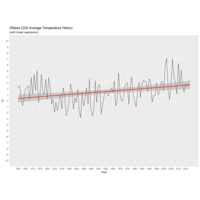
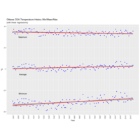
Plot Ottawa CDA with max/mean/min temp 1900-2018
The red line is the linear regression for the series.
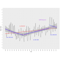
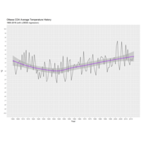
Plot Ottawa Ontario Canada mean temperature
This plot shows the mean temperatures for Ottawa Canada, as obtained from the Central Experimental Farm weather station, for the period between 1900 and 2018. The purple regression line (and standard error bands) were computed with the loess method, which does a better job of tracking cyclical patterns than linear regression. The red line shows the linear regression for the entire 118 year period. That period is then broken up into 1900-1942, 1943-1999 and 2000-2018 with separate linear regressions (in blue) for each period -- illustrating the fact that unlike what the red regression line suggests, temperatures were declining in the first half of last century, then trended upward in the last half, but are now trending downward in this century.